Mathieu Tozer's Dev Blog
Cocoa, the development of Words, and other software projects (including those dang assessment tasks).
Award For The Worst Online Login / Password Changing UI: Westpac Bank
Published Saturday, February 11, 2006 by Mathieu | E-mail this post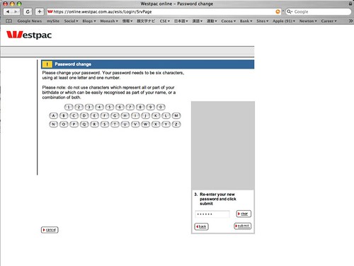
The grey space above point 3. previously showed 2 other such boxes asking for my original, then my new password, which I had to type in with my mouse, on a non qwerty onscreen keyboard. Apparently intuition is to suggest that I have two other steps to go after the first, because of the size of the box. Isn't ajax meant to make things easier?
The login screen for my online banking now uses this system as well. It SUCKS
About me
- I'm Mathieu
- From Taipei, Taipei, Taiwan
- Vcard English 日 漢
- My profile
Previous posts
Braawse
- 2005-08-07
- 2005-08-21
- 2005-09-18
- 2005-09-25
- 2005-10-02
- 2005-10-09
- 2005-10-16
- 2005-10-23
- 2005-10-30
- 2005-11-06
- 2005-11-13
- 2005-11-20
- 2005-11-27
- 2005-12-04
- 2005-12-11
- 2005-12-25
- 2006-01-01
- 2006-01-08
- 2006-01-15
- 2006-01-29
- 2006-02-05
- 2006-02-12
- 2006-02-19
- 2006-02-26
- 2006-03-05
- 2006-03-12
- 2006-03-26
- 2006-04-02
- 2006-04-09
- 2006-04-16
- 2006-04-23
- 2006-04-30
- 2006-05-07
- 2006-05-14
- 2006-05-21
- 2006-05-28
- 2006-06-04
- 2006-06-11
- 2006-06-18
- 2006-06-25
- 2006-07-02
- 2006-07-09
- 2006-07-16
- 2006-07-23
- 2006-07-30
- 2006-08-06
- 2006-08-13
- 2006-08-20
- 2006-08-27
- 2006-09-03
- 2006-09-10
- 2006-09-17
- 2006-09-24
- 2006-10-01
- 2006-10-08
- 2006-10-15
- 2006-11-05
- 2007-01-14
- 2007-04-15
- 2007-04-22
- 2007-05-06
- 2007-08-05
- 2007-08-12
- 2008-02-10
0 Responses to “Award For The Worst Online Login / Password Changing UI: Westpac Bank”
Leave a Reply